I've decided to write yp the last half of my evaluation/book work for my Sequential Image's stage 2 project, as I did go ahead with my idea of making the zine completely digital. This make it much easier to share any work I did in a high quality and also have the write up alongside it easy to find!
*added note! -
Images are viewable at a bigger size, Just click to view and to have them laid out as a slideshow *
~ ~ ~ ~ ~ ~ ~ ~ ~ ~ ~ ~ ~
This was a digital sketch of my first panel, just to get to grips with how I could go about drawing it up.
I used the program FireAlpaca for all my work, as I found it had a real smooth outcome and was crisper line art than I could get in photoshop.
From here I then got together a grid that was an edited version of what was provided. This way I knew how my final pages would end up and it would also be easy to move around the panels, if need be.
With the grid pattern being just smaller than A5, this would give some room for a black outer page layout, which I wanted to add as I felt it would fit the theme and mood of my zine overall more than a white boarder or just framed with black lines. My first page (being also the only full page) would be placed within the 6 squares.
~ ~ ~ ~ ~ ~ ~ ~ ~ ~ ~ ~ ~ ~ ~ ~ ~ ~

For the backgrounds, I didn't like or feel my observational drawings were strong enough to carry on to use in this final piece, So I used images I had taken from from my trips to the Plymouth Baribcan when I was drawing to use instead. I sketched over them in a way that Dave McKeen did for his comic, 'Cages'. I was also inspired by the way he coloured the backgrounds with simple colours, that I will use as inspiration when inking.
These images I took from within two different shops, The first two were from one end of a Military store just off from new street and the other from a store just under it. Both places were full of really old items that inspired by story being themed around a ghost looking for a lost and treasured item.
I spliced the images together so that I could create some place new but also have enough detail in there to look like a real place. This drawing will be used through out most of my pages, so adding in the extra details felt important as this would be the key location, drawing enough of the room that I could easier move it around to have my two characters appear to be at different ends of the room.

Other location-based photos I used where streets and doorways, That I sketched over in the same way. I felt much happier with this as I could get the perspectives I wanted while making sure the backgrounds looked like places! Also, I like to focus more on character design and story, so the backgrounds would have taken me much longer to get just right if I didn't do them this way.


~ ~ ~ ~ ~ ~ ~ ~ ~ ~ ~ ~ ~ ~ ~ ~ ~ ~ ~ ~
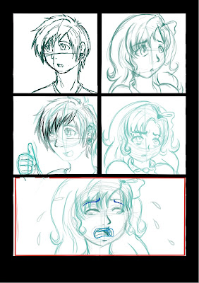
Next was onto sketching my thumbnails, but digitally. I sketched each panel up inside the grid patterns, so give me an allowance of room and to make sure my characters would fit in the finished product. It was an easier way to work than just drawing each panel and pasting them in after they were done. To make sure I knew what layers were my sketches, I decided to draw them in a light blue, so that if I needed to add more to the sketches, I could go over in a darker blue to see where my new line out will be or to make tracing for the finished outlines much easier. Below are the full sketches before drawing them as the finished line arts ready for colour :
 |
| Page 4 |
 |
| Page 3 |
 |
| Page 6 |
 |
| Page 5 |
 |
| Page 7 |
 |
| Page 8 |


No comments:
Post a Comment