Showing posts with label narrative planning. Show all posts

Sunday, 17 January 2016

BAIL201 - Sequential Images - Stage 2 - Shading and Final Touches

With the outlines cleaned up and inked, it was time to do the background colours. I wanted to have the shading be fairly simple and almost like a cel shaded animation. with only limited colours with a touch of a highlight with a darker colour to give my character more depth. 

                                                                ~  ~  ~  ~  ~  ~  ~  ~  ~  ~

For Joey's shading, I did it in 3 stages. One was a simple base layer with no shading or differences in colours, asides from his eyes which I added the extra detailing on at the stage also, so that they would be ready when the highlights would be added. The highlights give him extra depth and allow him to look more real, Taking a darker shade of each area I was colouring, I followed the line art to where shadowing would be. 


Joey's hair was done last, As I personally found it easiest to colour in the red section of his hair with a screen print effect layer, so that I can trace over the highlights with a dark red and the rest a lighter shade of red, so make it fit with the rest of his shading.

Even though only 2 colours where used for the shading, I like the comic/manga-ish style and felt it looked fitting with my own style. The Cel shading style was also effective enough to look professional but while also not being overly time consuming also.


                                                     ~ ~ ~ ~ ~ ~ ~ ~ ~ ~ ~ ~ ~ ~ ~ ~ ~ 


As for my ghost girl character, I didn't add any highlights for depth as I felt she seemed more ghost-like without it. Instead I used a light but dull blue to fill in her hair, clothes and skin with an added "Screen print" effect on the layer so that you can just about see through her. 

Also adding the outer glow to her, when it went under the lineart and effected the colour of her, It seemed to give her a ghostly depth that was much more fitting. The glow effect was made by drawing a rough line all around the outline with a very pale blue, almost white, and using a blur tool to fade out the edges.


^ I also added a dark toned background with some lines to test the transparency of the coloured layer. I was really happy with how this came out! 


As the comic goes on, I changed the background colour to a lighter blue, so make the effect of her glowing brighter and then later fading away more visible and easy to see without text explaining what was happening. I do think it translated well and can be seen when read. The final panel when she is vanishing was created by turning down the saturation and opacity, as well as using the blurring tool to it's maximum effect. A few more glow-like layers were added so give off a epic feeling, fitting for a final page. 


                                                       ~ ~ ~ ~ ~ ~ ~ ~ ~ ~ ~ ~ ~ ~ ~ ~


When it came to backgrounds, I also wanted them to have a similar way of shading as it would fit in with the characters and overall look of the Zine, but also I didn't feel overly confident with colouring the backgrounds, so this made the task a little easier for me to handle. I think it still worked, as the depth of the buildings are there, looking comic-y while also looking slightly realistic.

The finishing touches for most of the pieces was a simple glow on street lamps, the moon and some windows, that were created the same was the ghost girl's glow was done. I ended up being really pleased with the outcomes, seeing as I usually really dislike doing any backgrounds or landscape type work!


I was also inspired by Dave McKeen as mention in my last post but also this youtube video I found when looking for more building colouring inspiration :        https://www.youtube.com/watch?v=ddALJ0S3ycg


BAIL201 - Sequential Images - Stage 2 - Sketches for the Zine


I've decided to write yp the last half of my evaluation/book work for my Sequential Image's stage 2 project, as I did go ahead with my idea of making the zine completely digital. This make it much easier to share any work I did in a high quality and also have the write up alongside it easy to find!

*added note! - 

Images are viewable at a bigger size, Just click to view and to have them laid out as a slideshow *
                                                                 ~ ~ ~ ~ ~ ~ ~ ~ ~ ~ ~ ~ ~ 


When I finally had my thumbnail sketches complete in my book, I then took to my drawing tablet to start my final panels.

This was a digital sketch of my first panel, just to get to grips with how I could go about drawing it up.

 I used the program FireAlpaca for all my work, as I found it had a real smooth outcome and was crisper line art than I could get in photoshop.

From here I then got together a grid that was an edited version of what was provided. This way I knew how my final pages would end up and it would also be easy to move around the panels, if need be.


With the grid pattern being just smaller than A5, this would give some room for a black outer page layout, which I wanted to add as I felt it would fit the theme and mood of my zine overall more than a white boarder or just framed with black lines. My first page (being also the only full page) would be placed within the 6 squares.


                                                      ~ ~ ~ ~ ~ ~ ~ ~ ~ ~ ~ ~ ~ ~ ~ ~ ~ ~ 


For the backgrounds, I didn't like or feel my observational drawings were strong enough to carry on to use in this final piece, So I used images I had taken from from my trips to the Plymouth Baribcan when I was drawing to use instead. I sketched over them in a way that Dave McKeen did for his comic, 'Cages'. I was also inspired by the way he coloured the backgrounds with simple colours, that I will use as inspiration when inking. 


These images I took from within two different shops, The first two were from one end of a Military store just off from new street and the other from a store just under it. Both places were full of really old items that inspired by story being themed around a ghost looking for a lost and treasured item. 


I spliced the images together so that I could create some place new but also have enough detail in there to look like a real place. This drawing will be used through out most of my pages, so adding in the extra details felt important as this would be the key location, drawing enough of the room that I could easier move it around to have my two characters appear to be at different ends of the room.


Other location-based photos I used where streets and doorways, That I sketched over in the same way. I felt much happier with this as I could get the perspectives I wanted while making sure the backgrounds looked like places! Also, I like to focus more on character design and story, so the backgrounds would have taken me much longer to get just right if I didn't do them this way.


~ ~ ~ ~ ~ ~ ~ ~ ~ ~ ~ ~ ~ ~ ~ ~ ~ ~ ~ ~                                             


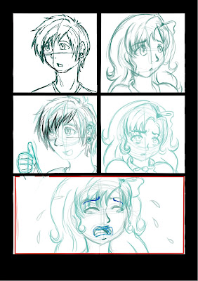
Next was onto sketching my thumbnails, but digitally. I sketched each panel up inside the grid patterns, so give me an allowance of room and to make sure my characters would fit in the finished product. It was an easier way to work than just drawing each panel and pasting them in after they were done. To make sure I knew what layers were my sketches, I decided to draw them in a light blue, so that if I needed to add more to the sketches, I could go over in a darker blue to see where my new line out will be or to make tracing for the finished outlines much easier. Below are the full sketches before drawing them as the finished line arts ready for colour :

Page 1
Page 2


Page 4
Page 3


Page 6
Page 5
Page 7
Page 8