Showing posts with label jason. Show all posts

Monday, 23 November 2015

Scale - Small

Robert Crumb's "Short History of America" - 1979
Scale can be shown on a small scale in many different ways, Time can be difference scales but our everyday small time scales can be setting our alarms in the mornings, checking out phones through the day or measuring the time it takes to prepare or cook our food. But how do we show the passing of time through art?

Robert Crumb's comic panels focus on a view of a patch of land, each panel having either a major or minor change, based around what could of happened with in what time frames he's wanted to show us. Many of his pieces have one large jump in showing time were a road or path my pop up, followed by smaller changes like lampposts or gas stations; and yet that is a small enough feature to show a rough time setting for just one panel.

Another example was Martin Creed's short film/music video "Thinking// Not Thinking" in which 2 dogs, one small and one medium walk back and forth, sometimes overlapping sometimes alone in different directions but always ending from one side of the screen to another. The small dog in this piece was to represent thinking, how it can be quicker to pass everything around it. However in this case, it also showed how scale can change through out, in moments the smaller dog is closer to the screen than the bigger dog, making the small dog, bigger and changing its state and scale. (You could also take it further and if you were to ad another animal next to the larger dog, the large dog would then become the small/medium animal in the piece.)


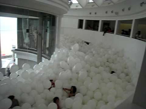
Other examples of scale within art we was shown was things like scale with in a space using balloon's as 'sculpture' that takes on the shape of the room, the small scale balloon's them self become a large scale piece by taking the shape. This can mess with a persons emotions and vision when viewed from within, scary? Weird? Disorientating? Fun?

Chris Ware's Building Stories also explores people within scale, the stories of many people living within a apartment complex, The largest drawing in this series happens to be the smallest character; a baby. (Related note - The Walled City 'Kowloon', houses built and built up again)


                                           ~ ~ ~ ~ ~ ~ ~ ~ ~ ~ ~ ~ ~ ~ ~ ~ ~ ~ ~ ~ ~ ~ ~ ~


Pop culture can use scale for comedy, most noted through the famous Father Ted joke of "small or far away", Showing a small toy of a Cow vs the cow's in a near by field that just happen to look small because of where we are. This also happens to us in everyday life, all around us and often running in the background.

We also looked at the music video from Talking Head's Psycho Killer, in which was rather strange with messing with scale. It starts with the lead singer on a large stage, making him appear small in context but as the song carries on you hear a audience that seems to a large one at that, making you envision that the stage is in a larger area than we think, which in turn then makes the singer smaller again. The set behind him also is being built as the song goes on, which makes it strange as the stage is literally growing around the singer. Many of Talking Head's music videos play with the idea of scale, either them travelling in places (small or large) or a smaller scale thing again such as wearing oversized shirts or jackets.

Scale in terms of production value could be used as another example with two different versions of "Much Ado About Nothing". Joss Weden made a modern day version with actors he had worked with previously, asking them to take part for a favor and filmed entirely in his mansion within 12 days. Then we can look at a large budge movie, like the 1993 version which had many actors, customs and actors. The scale had be changed completely through almost every way possible, The location, The budget etc.

Some other things that were look at -
Venice Carnival - Anyone can be anyone for the day by wearing a mask
Cosplay - A modern-ish version (becoming someone different for the day through outfits)
Powers of Ten (1977)
Zoom out from the earth - Couple having a picnic seems medium/small scale untill you zoom out and see the town, city, nation, Earth, universe - Quick scale change until all people are small.

"The scale of the universe shows how quickly it changes"
       

                                                          Ways of Measuring Scale 


    Ladder of  Scale :

   Global
   National
   Regional
   Urban
   Body/Person

   Small - Page
   Medium - Stage
   Large - Region
   X Large - Nation/World


A Brief look at the Fibonacci sequence : 


The Fibonacci sequence or the Golden Spiral is the idea that everything fits in a pleasing way to the eye, within this geological spiral.

Almost everything seems to fit this sequence; Nature, Art and photography. Many artists use this when either painting or setting up a photograph to make sure the final outcome has a naturally pleasing composition. 


Sunday, 12 April 2015

Reading the Spatial - Approaches to What

The lecture part of this task was a really interesting look at spacing and what space is, how it can be used and how important it can be.

A good example of spacing used in art was the 1533 Painting "The Ambassadors" by Hans Holbein. The painting as been the subject of many debates due to the items involved in the work. Aside from the spacing of the two characters involved, the most eye catching piece of the painting has to be the 'squashed' skull in the middle bottom of the piece. The spacing factor of the skull isn't the way it is placed in the painting, But how you are placed when you view it. From the photograph the skull has the stretched look to it, But if you were to move the skull becomes in focus. The major debate of this piece is the idea that it pictures everything to do with wealth: Globes, nice clothes, books. However the hidden skull seems to be a underlying message of no matter how different life is for some, how rich or how poor, we all face death and that it's always there wherever we may be ourselves. 


The next part of the lecture was looking at the 'Spatial'. What is Spatial? What is space?

The Spatial is the relating to or involving of having the nature of space existing or happening in space. Space on the other hand is distance between points, objects or events. 

It was really insightful to think of the spacing of art through thing like comic panels, how the spaces between other panels, speech bubbles and placing of the characters can change the over all mood and tone of the story or moment. 

                              ~ ~ ~ ~ ~ ~ ~ ~ ~ ~ ~ ~ ~ ~ ~ ~ ~ ~ ~ ~ ~ ~ ~ ~ ~ ~ ~ ~ ~ ~ ~ ~ 

TASK :
Approaches to What?
Create a sketch/drawing/comic page based on your interpretation of Georges Perec's 'Approaches to What'


These were sketches alongside quotes from the extract of Approaches to What. I wanted to focus on doing sketches rather than a full drawing, as there were so many different quotes that gave me funny little ideas. I think my favourite ones are the "Question your spoons" just because I had an image of a guy staring at cutlery confused or someone surrounded by floating spoons as well as the one about "Our lives in a dreamless sleep" as it made me think of the movie Inception and to do some kind of panel thing with thought bubbles within thought bubbles. 

                  (The images can be enlarged by clicking on them to read my notes/ideas) 

References :

http://dictionary.reference.com/browse/spatial

http://dictionary.reference.com/browse/space

Wednesday, 8 April 2015

Reading the Temporal - Time and Art

Robert Crumb - "A Short History of America"
The lecture of Reading the Temporal started with asking firstly, what is 'temporal'? I had to admit, I hadn't really heard this word outside of a medical term such as the temporal parts of the brain, so looking up the definition was interesting to find out, how this word can be applied to different things. Temporal is to be related to time, lasting a short period of time or alternatively 'temporary'.

Looking at the comics of Robert Crumb was a good example of time shown in an art form, his series of 'A Short History of America' shows areas in different time periods, showing how a landscape can change with time, things being constantly removed, replaced or  built up. 


Comic's are probably the best example of how time can be seen in art, as multiple panels, pages or volumes allow the artist to show change based around a story and the progression of characters and where they are. Naturally, using the aging of characters are a easy way of showing the progression of time. 


The best example I can think of with this is the character of Carl Grimes from The Walking Dead comics. 


(The Walking Dead) Carl Grimes aging progression - 7 - 13/14 years old
Tony Moore (1st Panel) / Charlie Adlard (2nd and 3rd panel)

Christian Marclay's 'The Clock' stills
When thinking of Time used in film, most of us thought of Christian Marclay's 24 hour long film "The Clock", made up entirely from movie and TV show clips where any device showing the time is put into a day long compilation. 

It's quite an amazing idea that this film can last 24 showing the exact time of day while it's being watched (Example -  if the movie shows a clock with 3:00pm on it, If the film was started at mid day, then the correct time would also be 3:00pm real time) 


La Jetee Poster

The other film that we were shown was a short by Chris Marker called 'La Jetee'. It was really bizarre and from the notes I took at the time the film followed a man captured and used for scientific experiences in the aftermath of a fictional World War Three bombing in France. 

The man was being used to tap into his memories and past in hope that he could also tap into the future in further experiments. The use of time in this film was more Science Fiction themed, Involving time travel. The main conclusion is only seen at the very end of the film, where the man's first memory of a man being shot was actually his own death.  

Rather than a traditional movie, La Jetee is made from photographs to create a sense of movement and time flow. I think the use of the photograph slideshow style is really effective in creating a dramatic mood to fit the theme of the story. It's also not something many people will be used to seeing, so it becomes instantly quite eye catching for many people. 

"Glued to an image of his past, If we can handle the past then we can live in the future"


                                        ~ ~ ~ ~ ~ ~ ~ ~ ~ ~ ~ ~ ~ ~ ~ ~ ~ ~ ~ ~ ~ ~ ~ ~ ~ ~ ~ ~ ~ ~ ~ ~ ~ ~ 


Looking at other uses of time in art? 

Random thought when thinking of ways to show a passing of time was from The Walking Dead TV show, the shot-for-shot pan up on the city of Atlanta from Season 1 and shown again half way through season 5. (I do apologise for the heavy use of Walking Dead references in this post) 


The Walking Dead season 1 and season 5 screen caps / Episodes - Days Gone Bye // Consumed (c) AMC


Screencap from The Clock Puzzle in Silent Hill Downpour (c) Konami


Another quick thought I had was the use of clocks in the design and puzzles of the video game Silent Hill Downpour, that are used throughout the game as a reference to the main character's time being constantly pushed or always missed through his story, such as time he wasted in prison, how he was too late to save his son from being murdered, the time spent planning how to be imprisoned to get revenge on his son's murderer, etc. 


When thinking of other uses of time in art, I was kind of stumped for things I could think of asides from movies or TV shows that feature time travel or have heavy emphasis on timekeeping i.e Lost, The Time Travelers Wife, Doctor Who. So I wanted to get the description of the word 'Temporal' (As shown at the start of this post)  

What is temporal art?
Art that ceases to exist, examples  - Performance Art, Ice Sculptures, etc

Seen as a new and modern art movement that is still to really be widely recognized, many of us would have seen or experienced some form of temporal art in our life, Street performers using chalk on pavements, watching plays at the theater or watching a fireworks display. The fun of temporal art is that it encourages people to experience these things first hand, 

however the major downfall of the movement, is many people would share the art as photos or recordings online rather than first hand. 
Don Chapelle working on an ice sculpture

It's still a cool way to spread a piece of art that can't be replicated or seen at the time, but it does take away some of the magic if people prefer to view such pieces through screens. Some of my favourite examples of temporal art are the works of Don Chapelle. 

He makes his ice sculptures using a chainsaw to create both fine and simple details. Naturally, due to the nature of ice, his works are only able to viewed in the flesh on display for about a day depending on where his work is being displayed and stored.


Andy Goldsworthy's piece "Cairn" from 1997,
made and displaced in Herring Island, Australia 


The works of Andy Goldsworthy are fairly similar also. I came across his work while googling Temporal Art. He works with any kind of natural materials, such as stones, leaves and feathers that he displays is patterns in the wilderness of woods and such. Some of his works may last much longer than others, for instances feathers in a pond will only likely last in place moments where as twigs weaved together have a chance to last for a fair while. His work is something truly unique and I can't think of anyone who uses nature or art in such a way. 

I really struggled to find artists who fit into a temporal movement, and illustration/illustrators don't really seem to be the people found within the movement itself. Time can be found in many different subjects, mostly in film and television and the art work seems to be working it's way to incorporate more time-based works in the modern day. 


Salvador Dali - The Persistence of Memory
A classic example of a form of temporal art, could be Salvador Dali's 'The Persistence of Memory'. Seen as probably his most famous work, the dripping clock imagery is familiar to everyone, but yet it's still quite a mystery as to what Dali's meanings behind it could be.

Most would agree that the clock's in this piece would be about reminding us about death, the inevitability of time ending. The 'figure' in the bottom center of the painting could be also been seen as a dead creature, making the idea much more solid. However, I think the air of mystery surrounding this piece is a great addition in itself, making it a timeless image that people will be talking about for many years to come. 


Piece from 'Annabelle's Illustration' depicting fashion
from 1900 to 2000
Fashion is also another way of looking at time. Although this is another form of reading time that may not be completely illustration based, There are many ways to depict fashion. It can be seen through TV and movies but also through fashion clothing itself or fashion illustration all based on era's, What was popular at the time can be widely pinpointed to a decade or era, such as when most people think of neon colours in clothes we think of the 1980's. 


                                ~ ~ ~ ~ ~ ~ ~ ~ ~ ~ ~ ~ ~ ~ ~ ~ ~ ~ ~ ~ ~ ~ ~ ~ ~ ~ ~ ~ ~ ~ ~ ~

References : 

http://artstalks.tumblr.com/post/25038332771

http://www.brillianticesculpture.com/about.html Don Chapelle's website

http://dictionary.reference.com/browse/temporal 

http://www.moma.org/learn/moma_learning/1168-2

My own knowledge of Silent Hill/The Walking Dead 

http://totallyhistory.com/the-persistence-of-memory/


Bonus ref (?) / Theorist?


(Book preview) All though this book preview really isn’t about art and time, but the art of the passing of time, it was interesting to think about how time can effect things just by passing. It made me think of previous lessons where we’ve looked at renaissance art, thinking about how at the time science was the focus of peoples minds rather than religion, which affected the subject matters of the paintings.  Movements still appear to this day based around a societal way of thinking, such as the rise of graffiti as a ‘style’ or ‘movement’ to go with modern day rebellion and thought of an oppression many feel from governments. The ‘pop art’ movement that appeared shortly after World War II to give new life and fun to people using bright colours and popular images or things at the time to bring the country together.  

Friday, 21 November 2014

Group Presentation - Group D - Cubism

At the end of last weeks Lecture, We were given a list of art movements alongside groups that our year group has been in since the start of this term. I am in Group D, Who were presented with the movement Cubism. The presentation should be no longer than 10 minutes and everyone in the group should contribute towards it, including an original piece in that style. Firstly I went to look up the origins of Cubism alongside some of the most famous Cubist artists as part of the research, However I knew we'd have to wait and see when we could get the group together so that we can make sure we all do something different to add to the presentation. Within a few days we had made sure to add each other on Facebook, as it has been the easiest way to be in contact with each other. (Left, Group chat on Facebook to plan a get together)  


Here was the information I gathered before the meet up with the group on the 21st.  - 

Origins ~
In fine art, the term Cubism describes the revolutionary style of paint that was invented by Pablo Picasso and Georges Braque while they were in Paris during 1907-1912. The Cubist movement is largely influenced by geometric patterns and shapes and is often seen as a type of abstract or Realism art. Many believe Picasso’s Les Demoiselles d'Avignon (The Young Ladies of Avignon - 1907) and Braque’s L'Estaque (1908) to be the first real Cubist pieces. The Cubism movement continued to grow and had many other artists become labelled as ‘Cubists’ such as Marcel Duchamp, Salvador Dali and Francis Bacon. 
There are a listed four periods of Cubism:

* Early Cubism or  
Cézannisme (1908-1910)

* Analytic Cubism (1910-12) - Characterised by multiply viewpoints of an object that overlap

* Synthetic Cubism (1912-14) - Characterized by an overall flatter and more geometrically simplified style.

* Late Cubism (1914 - Present) 

Cubism can also been seen as a movement that started the trend of modern art movements, Inspiring others such as Futurism (1909-1914) and Dada (1916-1924).

Famous Cubist Artworks -

Guernica – Pablo Picasso
Nude Descending a Staircase, No.2 – Marcel Duchamp
The Weeping Woman – Pablo Picasso
Glass of Beer and Playing Cards – Juan Gris
Violin and Candlestick – George Braque


                         ~ ~ ~ ~ ~ ~ ~ ~ ~ ~ ~ ~ ~ ~ ~ ~ ~ ~ ~ ~ ~ ~ ~ ~ ~ ~ ~ ~ ~ ~ ~ ~ ~ ~ ~ ~

Most the the group could make it to the meet up that we planned (21st November, 11PM)  where we talked about what people had already done or would prefer to do. We all settled with an idea in mind and where given roles to research each. I chose to research one of the prominent Artists, George Braque. We also decided to research a total of 3 artists, roughly about 100 words per artist, as to keep the information informative and clear, plus to keep in with the 10 minutes we have. We also choose to keep to a Powerpoint presentation and have 4 key sections, Intro - Context - Influences - Legacy. We will also continue to keep in touch through Facebook and e-mail to send through our work and research to each other. 

This was my section of research on the artist Geroges Braque :

Georges Braque ~ 1882 – 1963

Houses at L'Estague - 1908 
Georges Braque’s father owned a decorative painting business, which influenced his interest in art from a young age. He would follow in his father’s footsteps and take up apprenticing as a painter-decorator. However after moving to Paris, his friendships with Raoul Dufy and Friesz inspired him to paint landscapes. He later befriended Pablo Picasso and the two created the movement of Cubism I the years 1908-1914. After he returned home from serving in the Army in World War I, His art focused mainly on a still life subject as he wanted to convey a feeling of be able to move around a painting. Braques will always be remembered as a leader of Cubism, but his works that included the styles of Impressionism and collage leave just as much as an impression on art today.

Some of his most famous works include ‘Violin and Candlestick’ – 1910 and ‘Houses at L’Estague 1908’


               ~ ~ ~ ~ ~ ~ ~ ~ ~ ~ ~ ~ ~ ~ ~ ~ ~ ~ ~ ~ ~ ~ ~ ~ ~ ~ ~ ~ ~ ~ ~ ~ ~ ~ ~ ~ ~ ~ ~  

Update 25/11/2014 

Most of the group met up again to go over the presentation now that we had all gathered information over the weekend. We sat down around a computer and doubled checked that we did have all the information that we wanted, ready to then be finalized as a powerpoint for the presentation. Firstly we talked through the order of the slides and settled on a layout as such : 

Intro - Types of Cubism - Context - Artists - Legacy - Our own works 

We managed to get the bulk of the powerpoint done, asides from the final slides of the groups own works, because the paintings are still in progress. However, We were happy with the outcome and it shouldn't need many final touches. We then agreed to all make notes and/or flash cards so that when it will be our time to do the presentation, we will all have a section to talk about. We will also work out who says what slide when we meet again and have the completely final version. 

                                                       Example of the presentation : 


When the day came to present out work, some of our group were away, so we couldn't use the plan of one person per slide. In the end Nate in the group said he would be comfortable reading the slides while someone changed them as he spoke. I believe we did well in gathering all necessary information and presenting it in a clear way that was easy to understand. Our group worked well together and we did manage to get everything done on time. 


The finished version of the powerpoint will be uploaded separately as a viewable powerpoint when compete.

EDIT -
Powerpoint has been uploaded an is viewable on the blog :)
Just search for posts related to BCOP100 for the entitled "Cubism Presentation - BCOP"


              ~ ~ ~ ~ ~ ~ ~ ~ ~ ~ ~ ~ ~ ~ ~ ~ ~ ~ ~ ~ ~ ~ ~ ~ ~ ~ ~ ~ ~ ~ ~ ~ ~ ~ ~ ~ ~ ~ ~ ~ ~


Sources used : 

http://www.visual-arts-cork.com/history-of-art/cubism.htm

http://arthistory.about.com/od/modernarthistory/a/cubism_10one.htm

http://www.theartstory.org/artist-braque-georges.htm

http://www.tate.org.uk/art/artists/georges-braque-803


http://www.artchive.com/artchive/B/braque.html

Tuesday, 18 November 2014

Reading the Visual

For today's task, we all had to pick out a book from a table. I choose this one as it one of the ones that caught my eye the most. We where then given sheets to complete, filling it with information about the book we chose. The book called The Queen in Hell Close, an extract from The Queen and I by Sue Townsend. 


 DENOTATION - 

The cover features a strong and bold complimenting red and blue amongst a off-white background featuring a black and white portrait of the Queen, most commonly seen on British banknotes worth £20 or £50.  However the extra addition of a tongue and what looks like ears or wings have been pasted over top of the image, giving it a gratified style. The style seems to be a mix between a traditional British piece and Punk-ish inspiration. The image as a whole is completely central on the cover and is pretty much symmetrical asides from the rough, ripped-like edges on the British flag. The line work of the piece is also very strong and clear, which allows the graffiti details to stand out from the protrait of the Queen, but not too much as to look out of place. The Background of the flag also helps bring the piece together and create a eye-catching cover. I also like how the typeface is that of a British banknote, as it brings the cover full circle and matches the portrait used. It's a fair mix of both traditional and contemporary elements. As for the texture of the book, there are no stand out textures, as the book is all a soft, shiny plastic coating, creating a softback. The construction of the piece looks like the was most likely done all through a digital medium, due to the clear lines and bold solid colours.


CONNOTATION  -
The cover was designed by D*Face and the original piece is titled "Dog save the Queen". This version of the book was published in 2005 under the "Pocket Penguin" line and part of the 70 year celebration of Penguin Publishing.  The visual style of the cover is quite punk-esque and rebellious, giving it a modern-ish to 70/80's look. It reminds me alot of the Sex Pistol's God Save The Queen artworks, which may have been an inspiration for this cover? The possible symbolism of this could be to show that the novel is about the Royals or maybe set during a time when punk was the fashion and alive? However, It also could be seen as a image to entice someone with a taste for political humour or those who are more open-minded to slightly more obscure stories that use powerful British people are their characters. 


After studying the cover for this time, I then decided to read the blurb, just so see if the cover image fits with what I think it could be about. This book is an extract from the novel "The Queen and I" in which the Royal Family are sent to live in a counsel estate. The back of the book also says that the writer is well know for her stories that "Satirize British life", which I think the cover fits really well to the story. The function of the piece would be mostly to catch the attention of people and give you a hint about what the book might be about.

I also wanted to find out more about this piece and the artist D*Face, this would also help find out how exactly the image was created and how much it may have cost. 

D*Face (Real name Dean Stockton) is a British Street artist who uses mostly spray paints, stickers and stencils for his works. The 'wing' like design that is seen on the book cover seems almost like a signature of his, as on most of his works there is a character or something with the same design on them. The original print for this cover is titled "Dog Save the Queen" and is actually a Spray paint and screenprinted piece, Sold off as part of a collection, with some pieces having different background colours or some with no background at all. The prices for this print can differ, ranging anyway from £800 - £1,700. The sizing of the pieces are also roughly about 24"x 35". 

          ~ ~ ~ ~ ~ ~ ~ ~ ~ ~ ~ ~ ~ ~ ~ ~ ~ ~ ~ ~ ~ ~ ~ ~ ~ ~ ~ ~ ~ ~ ~ ~ ~ ~ ~ ~ ~ ~ ~ ~ ~ ~ ~ 

For the lecture part of today, we then had another sheet to fill out, firstly looking at objects and their meanings, how simple signs are universal objects that we can all understand i.e Apple meaning Health, Temptation or how a Rose means romance or love and using the colour red reinforces that meaning. 
The images and meanings from this cover how I see them

1. (The Signifier) Image of the Queen - (Signified) Royalty, British/English Culture, Wealth 

2. (The Signifier) Text the same as banknotes - (Signified) Money, Wealth, Worth, Riches

3. (The Signifier) British Flag - (Signified) British Culture, British things, Pride, Unity, Power

What elements of those signs suggest that meaning would need to be leaned and/or basssed on  shared cultural agreements? 

Linking everything back to things used only (or largely) in Britain/British culture i.e - A Royal family, British currency. Also learning through money and know that money is important and often times more money is seen as to be successful. The British flag however could be seen as a bit different, as although most people feel a sense of pride, there are those who would disagree and how their own feelings about it. 

Are there any elements to the design/illustration that look displaced from their original context? 

Yes, The British banknote portraiture of the Queen and the text in the same style that is found on a banknote too. They have been taken and turned into a new image for this cover. 

Can you find evidence of a "tone of voice" within the design/Illustration? 

This cover is very tongue 'n' cheek, a mixture of the British class system - posh and punk. It also has a laid back feeling to it with a humorous boarder-line political change.  

Is there a polysemic quality to the illustration/design where the meanings are open to a 'chain' of possibilities? Or are they close 'texts' where meaning is 'locked down' to limit the range of possible readings? 

I believe this cover is a more closed text piece than anything, because overall it give you the clear image of British-ness, Royalty and wealth, However the punk-ish themes also give you a hint of the novel hiding away a hint of turning all that around.

Finally, based on what you know of the book itself - from experience or from the blurb on the back cover - how successful is communication of the ideas/text within? 

I believe it;s a very successful cover, as it is indeed about the Queen/Royal Family and after reading the blurb, it states that they are living as common people, So the punk style elements help to break down the posh and proper way of life that the Royals would have been used to. Although, I believe the reason why it's such a good cover is because it still hints at things the book could really be about, even though you guess it would be about the Queen or the Royal Family, I don't think anyone would guess it would contain such a story! 

        ~ ~ ~ ~ ~ ~ ~ ~ ~ ~ ~ ~ ~ ~ ~ ~ ~ ~ ~ ~ ~ ~ ~ ~ ~ ~ ~ ~ ~ ~ ~ ~ ~ ~ ~ ~ ~ ~ ~ ~ ~ ~ ~ ~ ~ ~ 
I also wanted to wrap up the research of this book by looking at past covers. The original cover was designed by English Cartoonist and Illustrator, Martin Honeysett. The first publishing was in 1992 and by the company Methuen. This cover is very different to the D*Face cover in the way this one is much more simple and in my eyes, doesn't really give you any kind of hint as to watch kind of book this maybe. In fact, I actually thing this cover is quite boring and doesn't really make me want to pick up the book to find out what it's about. 

The other version of a cover I found was by artist Stephanie von Reiswitz. This was called the "Jubilee Edition" for the 2012 re-printing. This cover is much more likeable than the original and overall better at conveying the idea that the story is a more laid back, humorous look on the Royals. However, I'm not sure if I'd go as far as to say I like this version more than that D*Face cover.  


Another version of the blurb : 

When a Republican party wins the General Election, their first act in power is to strip the Royal Family of their assets and titles and send them to live on a housing estate in the Midlands. 

Exchanging Buckingham Palace for a two-bedroomed semi in Hell Close (as the locals dub it), caviar for boiled eggs, servants for a social worker named Trish, the Queen and her family learn what it means to be poor among the great unwashed. But is their breeding sufficient to allow them to rise above their changed circumstance or deep down are they really just like everyone else?   


    ~ ~ ~ ~ ~ ~ ~ ~ ~ ~ ~ ~ ~ ~ ~ ~ ~ ~ ~ ~ ~ ~ ~ ~ ~ ~ ~ ~ ~ ~ ~ ~ ~ ~ ~ ~ ~ ~ ~ ~

Sources : 


http://www.artcollectorz.com/artworks/artwork-detail?artwork_id=332&edition_id=437

http://www.christies.com/lotfinder/prints-multiples/dface-dog-save-the-queen-5756761-details.aspx

http://www.ebay.co.uk/itm/like/121476221895?limghlpsr=true&hlpv=2&ops=true&viphx=1&hlpht=true&lpid=108&chn=ps&device=c&adtype=pla&crdt=0&ff3=1&ff11=ICEP3.0.0-L&ff12=67&ff13=80&ff14=108

http://www.opus-art.com/the-artists/artist/dface/artwork-1699/dog-save-the-queen-1232

http://soakyourbuns.com/buy-art/dface-dog-save-the-queen.html


Thursday, 6 November 2014

Reading the Material - Detritus


 In our lecture this week with Jason, we looked at what material is and the stuff around us. The project we had to take away with us was the word "Detritus." Make a A4 poster that illustrates detritus of the city, look around us for inspirations, at the pavements and gutters. What is hidden within plain sight? 

Not ever hearing of this word detritus was interesting, and talking about the materials around us and how things can be wasted and/or used made me think that the word must mean waste or something along those lines. So before I started the project I had a look at various online dictionaries to find out any and all means of the word. Here is what I found and took note of: 


DETRITUS - (Dee-try-tus)

Latin origins from the word "Deterere" - To lessen, wear away.

*Waste or debris of any kind
* Disintegrated or eroded matter
* Loose Material/Disintegrated Materials
* In Geological Science - Loose mass of stones - Worn away from rocks
* In Biology - The organic debris formed from the decay of organisms
* Dead organisms/faecal materiel
* Debris, Junk, Rubble, Dust, Rubbish, Trash, Scrap, Stuff

From this, I then took photos of things that fit the meanings, anything that looked old and ruined. 


 Photos taken by me from Western Mill Cemetery/Baby Garden, View from my living room at night, View from the Plymouth Eye and Tree near Estover/Leigham by ASDA. 


I really wanted to make a poster that mixed both the photos and drawings for this project, so I first started editing the photos I wanted so that they could be used with any drawings I did. Any edits were mostly simple such as adding a noise filter or changing the contrast/brightness. I then searched for a interesting and different text to use for the poster as I also wanted to add a heading with the word incorporated into it. I then found the font Witching Hour by Anthony Robinson on Dafont.net that I used for a heading overlapping the cemetery photo. I picked this as I thought it made the most eye catching header out of the all the images. The text used underneath was called Black Chancery by Doug Miles, also found from Dafont.net. The image on its own looked interesting to me, almost like a death metal band cover or something. 


I ended up drawing the lamppost picture (at start of post) as I thought it would be a challenge for me as I never usually draw these kind of things. I ended up going over the pencil outlines in fineliner to make it that much bolder. I then coloured the piece with watercolour paints. I found this quite difficult but I did like the effects I managed to get. 


The final poster had an over all noise filter on top of other edits to make the images look all together. The drawing also had some brightness and saturation edits to make it a bit more like the photos. When the images were placed as I wanted them, I then made a version with and without text including the definition of the word Detritus. I think I prefer the poster without the text as I felt the text ended up getting in the way too much and making one panel seem too crowed, which ultimately doesn't fit in as a whole with the others. However, it was interesting to see what it looked like. The text had been copied and pasted underneath the black text with white so that it would stand out from the photo, although I added a glow effect as without it the text was still fairly unreadable. 


Monday, 27 October 2014

Las Meninas - Lecture and Evaluation

100 Words on 'Las Meninas' By Diego Velazquez


Las Meninas is a truly interesting piece of traditional art. At first it looks fairly plain, Like any other old style painting, But when you start to look in more detail, that's when you find the real fun this piece has to offer. The illusion of painting yourself painting seems like a modern day quirk yet it's something used here that at first is not east to see. I really like the almost puzzle solving-like mysteries this piece has, as it really separates it from any other painting from that time. It really shows the creativeness Diego Velazquez had.  

Wednesday, 22 October 2014

Reading the Map - Lecture overview and outcome

14/10/2014

Today we had a lecture about maps and mapping. We started off by looking at how differently the world map has changed since the 18th Century and how an aged map may not be as trustworthy as we think. It was interesting to look at just how different things can be from just a short period of time or just what someone else would picture and choose to create.
"Asia as Pegasus"


Another map we looked as was the famous London Tube Map. Even though it may be one of the most recognizable maps in Britain, It is actually quite different to a realistic rendition.

Other maps we looked at included a very unique map called "Asia as Pegasus" from 1590. The map of Asia was drawn to look just like that of a Pegasus (Winged Horse) and would be used to easily navigate by using parts of the horse to describe your journey - "I.E- Travel along the horses tail until you reach the flank, then you should be at Tokyo"

An even more interesting way to look at mapping and maps were the music videos and TV intros we watched, The music video by 'Cake' called 'Short Skirt Long Jacket' was at first glance a car driving with text messages along the screen, But it began to raise more questions as you watched, What do the text messages say? Where is the car going? The view from the car changed at one point, Why?

And finally we looked at the Game of Thrones opening title, The map of the fictional world was like a 3D Pop-up book as it moved around, Showing new and different locations, Interestingly enough, usually showing an actors name over a town where their character maybe in the episode. The visuals are totally different to most TV show openings, which is what makes it such a memorable opening as well as one that's fun to look at each time. 


Game of Thrones Screencap showing an aerial view of the country and it's name "Westeros"  

This then reminded me of the 'Walking Dead' opening, which follows a similar theme. Each series the images change to where the characters maybe more mentally and physically - I.E - Main character Rick Grimes's Sheriff's badge lies on the ground for season 2 (Along side the actors name, Andrew Lincoln), Symbolizing his change of 'doing what's lawful or right' to 'doing what we must to survive' or the slow pan of a prison, in which plays a big role in series 3/4. Other images may not be clear at first but as the series continues they seem more relatable to key moments - i.e Other buildings, bloodied weapons, strange out of place items. 

The Walking Dead screencaps from the opening sequence. Top middle example showing Rick's Sheriff badge.
 ~ ~ ~ ~ ~ ~ ~ ~ ~ ~ ~ ~ ~ ~ ~ ~ ~ ~ ~ ~ ~ ~ ~ ~

The project we had to take away with us was the create our own map of the college. We could choose to do any area of the college in any style/layout we wished, just no bigger than A4. 

Doing a short film mapping out my journey to college in this style crossed my mind, However I knew I wouldn't have the time/equipment to do this within a week. I instead looked at some of my favourite video games for inspiration. The world map of fictional Tamriel of the Elder Scrolls series crossed my mind as I like the way each region is in a different colour. But I then started to look at Silent Hill for inspiration, It's simple and realistic indoors style with markings to show locked doors/items seemed like a fun idea, So overall I picked a Silent Hill/Horror Survival Theme. (It is almost Halloween after all!)


(Temriel World Map - The Elder Scrolls, Brookhaven Hospital Map - Silent Hill 2, Map of Albion - Fable)


Our finished map is due to be shown: 21/10/2014My Finished Map Project ~