Showing posts with label mel. Show all posts

Saturday, 3 January 2015

Song to the Siren - Progress and the final piece

 When I had finished my research and sketching (See Workshop book) I then went about drawing my Sailor for the final illustration. Adding in the fish as well so that I could later change the colours or details later in photoshop if I felt the need to. This was the progress of the drawing through to being finished and inked. 


With the scanned image I firstly removed all the white background pieces with the magic wand tool and some manual eraser work for hard to get places such as the beard/hair and tattoos.

I also played around with a few effects and colours to see what might happen and if anything could be used as part of the final outcome.


When I was starting to cut things into layers (e.c - Sailors hair, tattoos, fish) I copied an extra layer of fish to see what colours might look best and hid the original layer from view. When I re selected the layer I really liked the overlaying of the fish and decided to keep it. As I went on I also decided to do another ring of fish, changing the colour and shape as it looked much more dramatic and really framed the piece.
Seeing as this project was limited to colour use, as well as not being able to use solid black, I changed the outlines to a dull blue and hair outlines to dark brown. I also wondered at first about giving the Sailor blue-ish skin to have a drowned, underwater effect, but each shade I tried didn't look right.


 When I had gotten the right skin tone I was after and finished changing the outlines colours, I tried playing with backgrounds. I knew I wanted something simple and changing from dark blues to light to get a deep sea effect/look. This was a test with the Liquidify tool, but it looked far too rough for what I had in mind. 


 Adding a grain effect and slight glow for a test, also changing the brightness/saturation. Really didn't like the grain effect so that wouldn't be added, but the glow effects would be played around with some more. The lighter and third layer of fish was added also. 


 The background was put through a blur filter to mix the colours together in a much smoother outcome. The glow effect around the sailor was brightened and stretched outwards too. 


Back to testing out colours with the sailor, I felt that his skin tones needed darkening a bit so more playing around with colours, saturation and brightness. 


 The last things added were more glow effects near the top to create the real underwater look and a bed of deep sea coral too. After creating rough, rock-like shapes I then carefully painted coral shapes and copy-pasted them into different areas. A second layer was added for more depth, which looked much more impressive. The layer at front was darkened and finished with a 'outer shadow' filter to enhance the depth further. 


When I thought I was finished though, I realised I didn't like the very middle piece of the coral bed. it was far too plank so I added in more coral shapes and changed the colours around just a bit more for extra framing. More shading effects were added too.


 When looking around for the shadow effect, I also found a lens flare effect. I added it for testing and realised that it added just what I was looking for to fill the empty, boring part in the middle of the sea bed. 

I decided to keep the lens flare because it also looked much more underwater with it added. It reminded me of the photographs people take when the camera is just below the surface and catches the light of the sun of the surface of the water.

I also added a smaller flare to the top of the piece to give the effect of seeing the sun through the water. I wasn't sure if it would work, but when added I really liked it and wanted to keep it. With that, I was happy with the final piece and added the lyrics in the Photoshop template. 


                   ~ ~ ~ ~ ~ ~ ~ ~ ~ ~ ~ ~ ~ ~ ~ ~ ~ ~ ~ ~ ~ ~ ~ ~ ~ ~ ~ ~ ~ ~ ~ ~ ~ ~ ~ ~ ~ ~ 

Tuesday, 18 November 2014

Reading the Visual

For today's task, we all had to pick out a book from a table. I choose this one as it one of the ones that caught my eye the most. We where then given sheets to complete, filling it with information about the book we chose. The book called The Queen in Hell Close, an extract from The Queen and I by Sue Townsend. 


 DENOTATION - 

The cover features a strong and bold complimenting red and blue amongst a off-white background featuring a black and white portrait of the Queen, most commonly seen on British banknotes worth £20 or £50.  However the extra addition of a tongue and what looks like ears or wings have been pasted over top of the image, giving it a gratified style. The style seems to be a mix between a traditional British piece and Punk-ish inspiration. The image as a whole is completely central on the cover and is pretty much symmetrical asides from the rough, ripped-like edges on the British flag. The line work of the piece is also very strong and clear, which allows the graffiti details to stand out from the protrait of the Queen, but not too much as to look out of place. The Background of the flag also helps bring the piece together and create a eye-catching cover. I also like how the typeface is that of a British banknote, as it brings the cover full circle and matches the portrait used. It's a fair mix of both traditional and contemporary elements. As for the texture of the book, there are no stand out textures, as the book is all a soft, shiny plastic coating, creating a softback. The construction of the piece looks like the was most likely done all through a digital medium, due to the clear lines and bold solid colours.


CONNOTATION  -
The cover was designed by D*Face and the original piece is titled "Dog save the Queen". This version of the book was published in 2005 under the "Pocket Penguin" line and part of the 70 year celebration of Penguin Publishing.  The visual style of the cover is quite punk-esque and rebellious, giving it a modern-ish to 70/80's look. It reminds me alot of the Sex Pistol's God Save The Queen artworks, which may have been an inspiration for this cover? The possible symbolism of this could be to show that the novel is about the Royals or maybe set during a time when punk was the fashion and alive? However, It also could be seen as a image to entice someone with a taste for political humour or those who are more open-minded to slightly more obscure stories that use powerful British people are their characters. 


After studying the cover for this time, I then decided to read the blurb, just so see if the cover image fits with what I think it could be about. This book is an extract from the novel "The Queen and I" in which the Royal Family are sent to live in a counsel estate. The back of the book also says that the writer is well know for her stories that "Satirize British life", which I think the cover fits really well to the story. The function of the piece would be mostly to catch the attention of people and give you a hint about what the book might be about.

I also wanted to find out more about this piece and the artist D*Face, this would also help find out how exactly the image was created and how much it may have cost. 

D*Face (Real name Dean Stockton) is a British Street artist who uses mostly spray paints, stickers and stencils for his works. The 'wing' like design that is seen on the book cover seems almost like a signature of his, as on most of his works there is a character or something with the same design on them. The original print for this cover is titled "Dog Save the Queen" and is actually a Spray paint and screenprinted piece, Sold off as part of a collection, with some pieces having different background colours or some with no background at all. The prices for this print can differ, ranging anyway from £800 - £1,700. The sizing of the pieces are also roughly about 24"x 35". 

          ~ ~ ~ ~ ~ ~ ~ ~ ~ ~ ~ ~ ~ ~ ~ ~ ~ ~ ~ ~ ~ ~ ~ ~ ~ ~ ~ ~ ~ ~ ~ ~ ~ ~ ~ ~ ~ ~ ~ ~ ~ ~ ~ 
For the lecture part of today, we then had another sheet to fill out, firstly looking at objects and their meanings, how simple signs are universal objects that we can all understand i.e Apple meaning Health, Temptation or how a Rose means romance or love and using the colour red reinforces that meaning. 
The images and meanings from this cover how I see them

1. (The Signifier) Image of the Queen - (Signified) Royalty, British/English Culture, Wealth 

2. (The Signifier) Text the same as banknotes - (Signified) Money, Wealth, Worth, Riches

3. (The Signifier) British Flag - (Signified) British Culture, British things, Pride, Unity, Power

What elements of those signs suggest that meaning would need to be leaned and/or basssed on  shared cultural agreements? 

Linking everything back to things used only (or largely) in Britain/British culture i.e - A Royal family, British currency. Also learning through money and know that money is important and often times more money is seen as to be successful. The British flag however could be seen as a bit different, as although most people feel a sense of pride, there are those who would disagree and how their own feelings about it. 

Are there any elements to the design/illustration that look displaced from their original context? 

Yes, The British banknote portraiture of the Queen and the text in the same style that is found on a banknote too. They have been taken and turned into a new image for this cover. 

Can you find evidence of a "tone of voice" within the design/Illustration? 

This cover is very tongue 'n' cheek, a mixture of the British class system - posh and punk. It also has a laid back feeling to it with a humorous boarder-line political change.  

Is there a polysemic quality to the illustration/design where the meanings are open to a 'chain' of possibilities? Or are they close 'texts' where meaning is 'locked down' to limit the range of possible readings? 

I believe this cover is a more closed text piece than anything, because overall it give you the clear image of British-ness, Royalty and wealth, However the punk-ish themes also give you a hint of the novel hiding away a hint of turning all that around.

Finally, based on what you know of the book itself - from experience or from the blurb on the back cover - how successful is communication of the ideas/text within? 

I believe it;s a very successful cover, as it is indeed about the Queen/Royal Family and after reading the blurb, it states that they are living as common people, So the punk style elements help to break down the posh and proper way of life that the Royals would have been used to. Although, I believe the reason why it's such a good cover is because it still hints at things the book could really be about, even though you guess it would be about the Queen or the Royal Family, I don't think anyone would guess it would contain such a story! 

        ~ ~ ~ ~ ~ ~ ~ ~ ~ ~ ~ ~ ~ ~ ~ ~ ~ ~ ~ ~ ~ ~ ~ ~ ~ ~ ~ ~ ~ ~ ~ ~ ~ ~ ~ ~ ~ ~ ~ ~ ~ ~ ~ ~ ~ ~ 
I also wanted to wrap up the research of this book by looking at past covers. The original cover was designed by English Cartoonist and Illustrator, Martin Honeysett. The first publishing was in 1992 and by the company Methuen. This cover is very different to the D*Face cover in the way this one is much more simple and in my eyes, doesn't really give you any kind of hint as to watch kind of book this maybe. In fact, I actually thing this cover is quite boring and doesn't really make me want to pick up the book to find out what it's about. 

The other version of a cover I found was by artist Stephanie von Reiswitz. This was called the "Jubilee Edition" for the 2012 re-printing. This cover is much more likeable than the original and overall better at conveying the idea that the story is a more laid back, humorous look on the Royals. However, I'm not sure if I'd go as far as to say I like this version more than that D*Face cover.  


Another version of the blurb : 

When a Republican party wins the General Election, their first act in power is to strip the Royal Family of their assets and titles and send them to live on a housing estate in the Midlands. 

Exchanging Buckingham Palace for a two-bedroomed semi in Hell Close (as the locals dub it), caviar for boiled eggs, servants for a social worker named Trish, the Queen and her family learn what it means to be poor among the great unwashed. But is their breeding sufficient to allow them to rise above their changed circumstance or deep down are they really just like everyone else?   


    ~ ~ ~ ~ ~ ~ ~ ~ ~ ~ ~ ~ ~ ~ ~ ~ ~ ~ ~ ~ ~ ~ ~ ~ ~ ~ ~ ~ ~ ~ ~ ~ ~ ~ ~ ~ ~ ~ ~ ~

Sources : 


http://www.artcollectorz.com/artworks/artwork-detail?artwork_id=332&edition_id=437

http://www.christies.com/lotfinder/prints-multiples/dface-dog-save-the-queen-5756761-details.aspx

http://www.ebay.co.uk/itm/like/121476221895?limghlpsr=true&hlpv=2&ops=true&viphx=1&hlpht=true&lpid=108&chn=ps&device=c&adtype=pla&crdt=0&ff3=1&ff11=ICEP3.0.0-L&ff12=67&ff13=80&ff14=108

http://www.opus-art.com/the-artists/artist/dface/artwork-1699/dog-save-the-queen-1232

http://soakyourbuns.com/buy-art/dface-dog-save-the-queen.html


Wednesday, 29 October 2014

Workshop with Mel

In our workshop with Mel,  We focused on illustrative  pieces. Starting with a sheet of shapes (Pictured left) that we could draw on, using the shapes however we please or however we saw to turn into something else.

We then moved onto a really fun and quick piece where we had to pick one of the three shapes - Circle, Square, Triangle. I picked triangle for the task and folded a A2 sheet of paper to use. The paper was folded into 8 sections that would end up being 8 actions the triangle will go through. 


First of all was the simply draw the shape we choose in 2D. So here is the start of the triangle. 


Then turn it into a 3D triangle. For each panel from here, we then had to make sure the next panel would include the difference from the previous (I.E - Keep the shape 3D throughout) Given time was about 30 seconds. 

 The third section was to then put holes in the 3D triangle. In the minute we had to draw the holes, I choose to make them look like bullet holes, including a bullet passing through also. 

Next was to stretch the triangle while still keeping the previous details. This was a little more difficult due to tryng to keep the holes in the same places, just stretched out. Given time for this one was about 2 minutes. 

Our next step was to add an object to our shape that we could see in the room. I choose my pen I was holding, also adding a arm and a hand for the triangle to hold the pen.

After that step, the change was an interesting one, So then turn the shape inside-out. We had to consider what it might look like, what would the texture be? So I went for a realistic, flesh-y and bleeding effect. Given time around 5 minutes.

The final steps were to then turn the inside-out shape back into 2D and to finish it up by rolling it up! 


This was a really interesting way to look at something so simple and turn it into something much more detailed and even create a small narrative along the way. Also, The way in which we folded the paper, it would then be re-folded to create a book-like presentation. 

~ ~ ~ ~ ~ ~ ~ ~ ~ ~ ~ ~ ~ ~ ~ ~ ~ ~ ~ ~


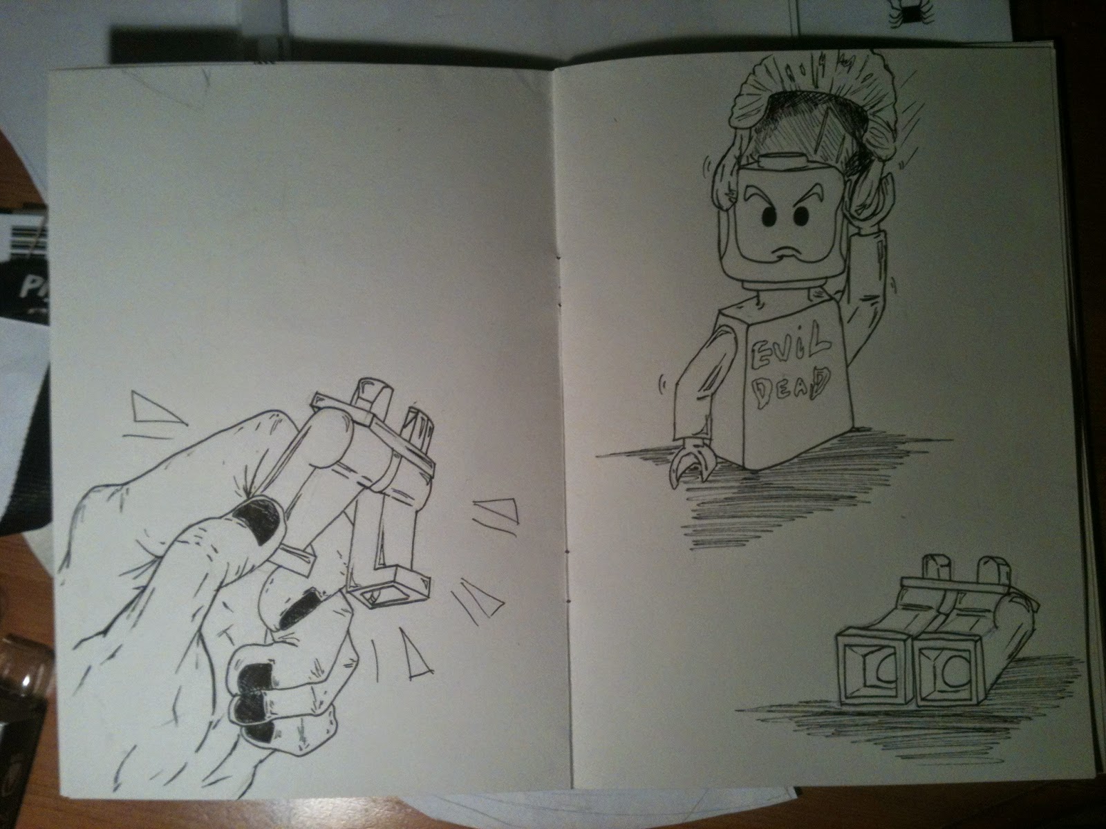
Our next piece was to first of all, take an item from a pile on a table. My chosen item was a lego figure. After we had our items, we where given awhile to draw the item to get used to how it looks, the different angles and views, if it can be moved etc. The sheet to the left was the sketches I did in the time we had. 

Another A2 sheet was folded and prepared for the next step. The sheet of paper was again folded into 8 sections that would then be turned into a sketchbook! 


While we waited to see how to use a stapling machine to turn the paper into a book, we started the next project. Our chosen item would be used to create a small story, the first 8 'pages' were written out for us and then finale 8 are left up to us to finish. The only rule we had was that we could not add sounds by writing them - I.E - Band! Thud!, But instead drawing shapes/images/marks to represent the sound.


The first page was simple. Draw the object. So I picked a very plain standing pose for the lego guy. Having the lego figure as a reference for each pose would be really fun to draw, as I had the freedom to move his head, arms and legs for each panel to create a unique pose.


 The second page was to then have our object being thrown/falling. Using my own hand as a reference, I drew the lego guy being thrown by a person. I also wanted to change his facial expression for a more comic-like effect. 

The third page was to then have the object land.I was really really pleased with how this panel turned out!  

Page 6 was to have our object be broken. Luckily, This lego figure could be pulled in half, which made drawing a 'broken' version quite easy as I would have a perfect reference to draw from. 

Page 7 was to then have the figure restored somehow, fixed with anything. I wanted to have the lego guy put himself back together again for a fun image that I could then maybe later use for the rest of the story. I hope to continue this comic and have a finished story presented in the book.