Showing posts with label workshop. Show all posts

Monday, 5 January 2015

Andy's Workshop - Katagelophobe Outcome


When I had my final idea, I then wanted to make it digital to be able to copy and paste my image as I had the idea to call my collective noun a "Mimic" of Katagelophobes. After all, a mimic being a copy of something, it made sense to have the final piece be a copy of the same image to go with the title. 
This was my finished piece with just the one person being Ridiculed. I went for something simple as for the most part of this project I was quite stuck for ideas and with simple expressions, I think it ended up being more obvious as to what the phobia could be compared to if it was more detailed. I also added a small outer shadow to the figures to make the colours pop more.                                                                                                                                                                                                                          

Then I copy and pasted the image and moved it around to create my final image. The frame around it, I felt, closed it in more and looked much better than just being left without.

~       A mimic of Katagelophobes     ~


Ben's Workshop - Digital Vignette


For the Digital Vignette, I decided to use my other piece for the Obsession project, as I really wanted to use this piece for something other than just an example of what ideas I had for a final piece.

It was quite difficult to work with this piece I found, but I did enjoy learning about the Drop Shadow effect in photoshop to create depth. Also, adding in dull opacity layers of colour between each layer was really interesting to use, seeing how each layer gets darker with every new layer added.

I choose to use blue as the colours in-between to go with the blue dots of watercolour from the original piece. I think it also complimented the red/pink of the lips as well. 


I would really like to use this style and these technqiues again, maybe when I have characters to use, as that would make for a much more interesting outcome. Also, characters would probably have a less busy look. However I do like the outcome from this piece too. I think it worked best on the bubbles in the corners and the black splashes with "Eyes shout what the lips fear to say". 

A total of  layers were used to create the image :

- Bubbles in the corner
- Lips and quotation in the splashes

- The eye-like pattern with repeated text
- Boarders hovering above the eye-like patterns
- The film reel-like pieces with the text and lip drawings 

Sunday, 4 January 2015

Ben's Workshop - Obsessive Personalities

This was my outcome with playing around on photoshop using Ben's online tutorials. All images are from google and taken from the section for fair use. To find them I googled simple things such as "eyes", "victorian" and "dogs".

The pink of the girls dress was changed using the screen layer technique, which is really useful to know. I can definitely see myself screen layers in future pieces. The eye-mask thing over the dog and the patterns in the paracol were used by using the clipping mask technique, which I found to be quite time consuming but fun to know how to do, as you could make so many weird pieces with the clipping masks.

I think I am happy with the outcome, as I wasn't 100% sure what to do with my images once I had found them. Either way, it was a interesting task and at least I learnt some more photoshop techniques that were completely new to me. 


These are the images I found and used to edit : 


Thursday, 4 December 2014

Workshop with India - Screenprint

Our workshop was India was about Screenprinting. I have never screenprinted before so this was totally new for me to try. We firstly picked out a design painted with acrylic on acetate to use and prepared a silk screen for printing. The Silk screen was prepared by dragging emulsion paint over one side and leaving it to dry for awhile. When dry, the acetate piece was placed onto a UV lamp machine with the dried silk screen on top. The UV lamp is turned on for 50 seconds to soften the paint around the design. The screen is then washed down with a hose and water, which then leaves behind just the design on the screen. When printed, the paint will act as a stencil to create the final piece.

The paints used were an acrylic blue and red, mixed with a solution to keep the acrylics from drying quicker than on it's own. This also makes printing much easier.  


The printing progress :

- Make sure printing machine is clean and tape down a sheet of tracing paper like material.


- Put tape along the edges of the silk screen to make sure paint will not bleed unnecessarily over the edges.  Secure silk screen to clamped frame on the printing machine.

-  Apply the paint to the top part of the silk screen and use the squeegee at a 45 degree angle and pull down to make the first print. Printing on the tracing paper like material gives you a starting point for the final print and to make sure the screen will create a clean print.

- Line up a sheet of paper under the screen, using tape to create a guild line for the paper and print again.

- When dry and if applying a second colour, use the tracing paper print to line up the paper underneath, to make sure the final print will line up with the first set of colour(s). Turn on the machines vacuum so that the paper will stay in place, Peel back the tracing paper and press the silk screen down and print.

Our final outcome was really clean and crisp and easy to do. The chosen colours worked well too as the blue was placed ontop of the red, which when overlapped created a dark blue tone for extra depth. I really enjoyed screenprinting and really want to try and create a design from scratch in the future. 

Tuesday, 4 November 2014

Workshop with Andy


Our workshop with Andy was all about exploring different materials. We started by using graphite pencils to create shapes to reflect feelings - i.e - Anger might be drawn has harsh, random lines. Then we moved on to 'draw' an image of our choice. I picked a David Bowie knitted doll and created my images using that as a reference. My favourite of these is the Newspaper collage, The hair started to come along really well! 


The moods sketches. Each sketch was given about 30 seconds. Drawn with Graphite.
Drawn using inks and brushes/toothbrush

Drawn using inks again but watered down with toothbrushes and glue and newspaper

Drawing with string and glue. This was really fiddle-y and complicated! 


Saturday, 1 November 2014

Workshop with Ben

For our workshop with Ben, The first half of the day was spent at the Plymouth Museum. We were given a few hours to walk around and make observational drawings in our sketchbooks.

I really enjoyed drawing the skulls that were on display there and decided to take a seat to draw a more detailed skull, the large Hippo skull. It was quite a difficult thing to draw but I really enjoyed it.

Any other items or objects that took my interested I also sketched down. Most drawings literally only had a few minutes or less on them. 


~ ~ ~ ~ ~ ~ ~ ~ ~ ~ ~ ~ ~ ~ ~ ~ ~ ~ ~ ~ ~ ~ ~ ~ ~ ~ ~ ~ ~ ~ ~ ~ ~
When we all headed back to college, the next step was to pick one drawing that we liked the most to then use as our reference for the next tasks. The drawing I decided to pick was the raven skull. I was torn between picking the raven skull, human ribcage and lamp-post as these were the drawings I felt I did the best or would be more interesting to use.


 The first task was to make a college of our chosen object using sugar paper. Cutting small strange shapes was the main challenge here as many of the details in the skull are quite small and mostly depth based. Layering some pieces to create shadows worked really well I felt and was quite happy with the outcome. I also decided to use yellow paper for the skull against the brown and black paper to frame it more and create a more interesting look than just if it was simply the yellow skull on a one coloured background. Finished piece was about A5 sized. 


The next task was really interesting and completely new to me. I've never used a photocopier to make a combined image of multiple drawings. For this piece we were given three pieces of paper, and a square to mark out as our limited space.  Using a lightbox, we had to trace the square onto the other sheets of paper and then draw different effects/layers of our drawings. Thinking about if we wanted outlines, shading, backgrounds, text or any other details was a bit of a challenge because of thinking how they might overlap or have better/worse effects when run through the photocopier. All that was needed to draw with was a bold marker as the colour would be added when put through the copier.

(The pencil line of a feather can still be seen as I was unsure as to if I may want to add it in on a later date) 


My 3 different layers and the finished outcome. Each drawing was put through in the order above ( Left to right) with the colours of purple, green and blue. I really enjoyed this task as it was something completely new for me to try out. 


Wednesday, 29 October 2014

Workshop with Mel

In our workshop with Mel,  We focused on illustrative  pieces. Starting with a sheet of shapes (Pictured left) that we could draw on, using the shapes however we please or however we saw to turn into something else.

We then moved onto a really fun and quick piece where we had to pick one of the three shapes - Circle, Square, Triangle. I picked triangle for the task and folded a A2 sheet of paper to use. The paper was folded into 8 sections that would end up being 8 actions the triangle will go through. 


First of all was the simply draw the shape we choose in 2D. So here is the start of the triangle. 


Then turn it into a 3D triangle. For each panel from here, we then had to make sure the next panel would include the difference from the previous (I.E - Keep the shape 3D throughout) Given time was about 30 seconds. 

 The third section was to then put holes in the 3D triangle. In the minute we had to draw the holes, I choose to make them look like bullet holes, including a bullet passing through also. 

Next was to stretch the triangle while still keeping the previous details. This was a little more difficult due to tryng to keep the holes in the same places, just stretched out. Given time for this one was about 2 minutes. 

Our next step was to add an object to our shape that we could see in the room. I choose my pen I was holding, also adding a arm and a hand for the triangle to hold the pen.

After that step, the change was an interesting one, So then turn the shape inside-out. We had to consider what it might look like, what would the texture be? So I went for a realistic, flesh-y and bleeding effect. Given time around 5 minutes.

The final steps were to then turn the inside-out shape back into 2D and to finish it up by rolling it up! 


This was a really interesting way to look at something so simple and turn it into something much more detailed and even create a small narrative along the way. Also, The way in which we folded the paper, it would then be re-folded to create a book-like presentation. 

~ ~ ~ ~ ~ ~ ~ ~ ~ ~ ~ ~ ~ ~ ~ ~ ~ ~ ~ ~


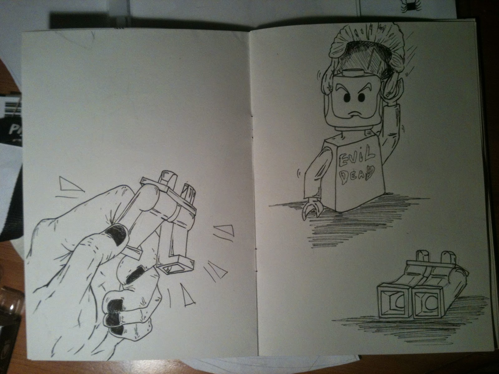
Our next piece was to first of all, take an item from a pile on a table. My chosen item was a lego figure. After we had our items, we where given awhile to draw the item to get used to how it looks, the different angles and views, if it can be moved etc. The sheet to the left was the sketches I did in the time we had. 

Another A2 sheet was folded and prepared for the next step. The sheet of paper was again folded into 8 sections that would then be turned into a sketchbook! 


While we waited to see how to use a stapling machine to turn the paper into a book, we started the next project. Our chosen item would be used to create a small story, the first 8 'pages' were written out for us and then finale 8 are left up to us to finish. The only rule we had was that we could not add sounds by writing them - I.E - Band! Thud!, But instead drawing shapes/images/marks to represent the sound.


The first page was simple. Draw the object. So I picked a very plain standing pose for the lego guy. Having the lego figure as a reference for each pose would be really fun to draw, as I had the freedom to move his head, arms and legs for each panel to create a unique pose.


 The second page was to then have our object being thrown/falling. Using my own hand as a reference, I drew the lego guy being thrown by a person. I also wanted to change his facial expression for a more comic-like effect. 

The third page was to then have the object land.I was really really pleased with how this panel turned out!  

Page 6 was to have our object be broken. Luckily, This lego figure could be pulled in half, which made drawing a 'broken' version quite easy as I would have a perfect reference to draw from. 

Page 7 was to then have the figure restored somehow, fixed with anything. I wanted to have the lego guy put himself back together again for a fun image that I could then maybe later use for the rest of the story. I hope to continue this comic and have a finished story presented in the book.