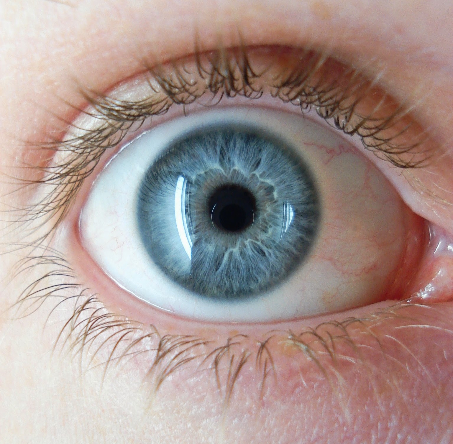
For Stage Two of the Visual Communication module I chose to illustrate the article about Sophie Ellis-Bector and Doll collecting : http://www.theguardian.com/lifeandstyle/2014/nov/07/why-collect-dolls-grew-out-stamps-sophie-ellis-bextor This is my finished piece alongside the edited article layout. The piece was made completely on Photoshop with scanned images from my sketchbook.
Showing posts with label photoshop. Show all posts
Tuesday, 13 January 2015
Stage Two - Visual Communication - Why Collect Dolls? Editorial
For Stage Two of the Visual Communication module I chose to illustrate the article about Sophie Ellis-Bector and Doll collecting : http://www.theguardian.com/lifeandstyle/2014/nov/07/why-collect-dolls-grew-out-stamps-sophie-ellis-bextor This is my finished piece alongside the edited article layout. The piece was made completely on Photoshop with scanned images from my sketchbook. Monday, 5 January 2015
Ben's Workshop - Digital Vignette

For the Digital Vignette, I decided to use my other piece for the Obsession project, as I really wanted to use this piece for something other than just an example of what ideas I had for a final piece.
It was quite difficult to work with this piece I found, but I did enjoy learning about the Drop Shadow effect in photoshop to create depth. Also, adding in dull opacity layers of colour between each layer was really interesting to use, seeing how each layer gets darker with every new layer added.
I choose to use blue as the colours in-between to go with the blue dots of watercolour from the original piece. I think it also complimented the red/pink of the lips as well.
I would really like to use this style and these technqiues again, maybe when I have characters to use, as that would make for a much more interesting outcome. Also, characters would probably have a less busy look. However I do like the outcome from this piece too. I think it worked best on the bubbles in the corners and the black splashes with "Eyes shout what the lips fear to say".
A total of layers were used to create the image :
- Bubbles in the corner
- Lips and quotation in the splashes
- The eye-like pattern with repeated text
- Boarders hovering above the eye-like patterns
- The film reel-like pieces with the text and lip drawings
Sunday, 4 January 2015
Ben's Workshop - Obsessive Personalities
This was my outcome with playing around on photoshop using Ben's online tutorials. All images are from google and taken from the section for fair use. To find them I googled simple things such as "eyes", "victorian" and "dogs".
The pink of the girls dress was changed using the screen layer technique, which is really useful to know. I can definitely see myself screen layers in future pieces. The eye-mask thing over the dog and the patterns in the paracol were used by using the clipping mask technique, which I found to be quite time consuming but fun to know how to do, as you could make so many weird pieces with the clipping masks.
I think I am happy with the outcome, as I wasn't 100% sure what to do with my images once I had found them. Either way, it was a interesting task and at least I learnt some more photoshop techniques that were completely new to me.
These are the images I found and used to edit :
The pink of the girls dress was changed using the screen layer technique, which is really useful to know. I can definitely see myself screen layers in future pieces. The eye-mask thing over the dog and the patterns in the paracol were used by using the clipping mask technique, which I found to be quite time consuming but fun to know how to do, as you could make so many weird pieces with the clipping masks.
I think I am happy with the outcome, as I wasn't 100% sure what to do with my images once I had found them. Either way, it was a interesting task and at least I learnt some more photoshop techniques that were completely new to me.
These are the images I found and used to edit :
Saturday, 3 January 2015
Song to the Siren - Progress and the final piece
With the scanned image I firstly removed all the white background pieces with the magic wand tool and some manual eraser work for hard to get places such as the beard/hair and tattoos.
I also played around with a few effects and colours to see what might happen and if anything could be used as part of the final outcome.
When I was starting to cut things into layers (e.c - Sailors hair, tattoos, fish) I copied an extra layer of fish to see what colours might look best and hid the original layer from view. When I re selected the layer I really liked the overlaying of the fish and decided to keep it. As I went on I also decided to do another ring of fish, changing the colour and shape as it looked much more dramatic and really framed the piece.
Seeing as this project was limited to colour use, as well as not being able to use solid black, I changed the outlines to a dull blue and hair outlines to dark brown. I also wondered at first about giving the Sailor blue-ish skin to have a drowned, underwater effect, but each shade I tried didn't look right.

Adding a grain effect and slight glow for a test, also changing the brightness/saturation. Really didn't like the grain effect so that wouldn't be added, but the glow effects would be played around with some more. The lighter and third layer of fish was added also.
The background was put through a blur filter to mix the colours together in a much smoother outcome. The glow effect around the sailor was brightened and stretched outwards too.
Back to testing out colours with the sailor, I felt that his skin tones needed darkening a bit so more playing around with colours, saturation and brightness.
The last things added were more glow effects near the top to create the real underwater look and a bed of deep sea coral too. After creating rough, rock-like shapes I then carefully painted coral shapes and copy-pasted them into different areas. A second layer was added for more depth, which looked much more impressive. The layer at front was darkened and finished with a 'outer shadow' filter to enhance the depth further. When I thought I was finished though, I realised I didn't like the very middle piece of the coral bed. it was far too plank so I added in more coral shapes and changed the colours around just a bit more for extra framing. More shading effects were added too.
When looking around for the shadow effect, I also found a lens flare effect. I added it for testing and realised that it added just what I was looking for to fill the empty, boring part in the middle of the sea bed.
I decided to keep the lens flare because it also looked much more underwater with it added. It reminded me of the photographs people take when the camera is just below the surface and catches the light of the sun of the surface of the water.
I also added a smaller flare to the top of the piece to give the effect of seeing the sun through the water. I wasn't sure if it would work, but when added I really liked it and wanted to keep it. With that, I was happy with the final piece and added the lyrics in the Photoshop template.
~ ~ ~ ~ ~ ~ ~ ~ ~ ~ ~ ~ ~ ~ ~ ~ ~ ~ ~ ~ ~ ~ ~ ~ ~ ~ ~ ~ ~ ~ ~ ~ ~ ~ ~ ~ ~ ~
Wednesday, 5 November 2014
David Bowie Digital Work
David Bowie Digital Works ~
The next step for our David Bowie works was to then experiment with photoshop and digitally play around with any black and white pieces we had. Unfortunately I lost my original works from the photoshop sessions and had to re-do pieces at home. These pieces were done on the programme Paint.NET, which is very much like photoshop. I first started with my Thin White Duke piece, as it is the simpler black and white piece I had made so should be the easiest to start experimenting with in paint.NET.
The first thing I did was remove the black areas with the Magic Wand tool, then made another layer to fill with another colour. I just used a purple colour as a test purely because it's my favourite colour. Afterwards, I thought of doing a much brighter colour to contrast with the black and dull purple shade.
After trying out a few different colours, I thought it would be interesting to use bright and bold colours to have a completely different outcome to the painted original piece. To almost change the mood setting completely, from gloomy and dark to fun and bright.


The next examples were to change the colours to basic primary colours (and green to fit a 4 piece), For a more typical Andy Warhol style pop-piece.
Again, One with and without a boarder. I was really really happy with these outcomes! Hopefully I will feel more confident to do something like this in future pieces!

The next piece I chose to experiment with was a 2 minute pencil sketch I did as part of the Bowie projects. I was really happy with the original piece as for only such a quick sketch, I liked the rough lines and think I managed to capture a simple yet (hopefully) noticeable Bowie reference.
For this piece the same step was taken as with the first. Using Paint.NET, I used the magic wand tool to remove the white background and written text, so that I was left with nothing but the outlines.
When doing things like this, I like the chance the background colour, just so I know if there is any white spots I may have missed or if there is a area that may need drawing on top of to make the outline stronger and easier to work with.
I used Paint.NET's Fragment Blur plug in to make the background much more striking, but also to make it less simple looking. The clear circles over one another just didn't look right and felt way to unprofessional. The blur effect dulled the shapes together to get the right kind of effect I wanted.

When I was finished with the image, I didn't like it without a boarder, mostly due to the fact the hair had not been fully drawn. Adding a boarder and cropping the image down was an interesting try too, as it focused more on the face. However now the more I look at the outcome of this one, I do quite like the messy look and unfinished endings to the hair and clothing. Although I could try come back to this one and try new things.
~ ~ ~ ~ ~ ~ ~ ~ ~ ~ ~ ~ ~ ~ ~ ~ ~ ~ ~ ~ ~ ~ ~ ~ ~ ~ ~ ~ ~ ~ ~ ~ ~ ~ ~ ~ ~ ~ ~ ~ ~ ~ ~ ~ ~
The next step for our David Bowie works was to then experiment with photoshop and digitally play around with any black and white pieces we had. Unfortunately I lost my original works from the photoshop sessions and had to re-do pieces at home. These pieces were done on the programme Paint.NET, which is very much like photoshop. I first started with my Thin White Duke piece, as it is the simpler black and white piece I had made so should be the easiest to start experimenting with in paint.NET.
The first thing I did was remove the black areas with the Magic Wand tool, then made another layer to fill with another colour. I just used a purple colour as a test purely because it's my favourite colour. Afterwards, I thought of doing a much brighter colour to contrast with the black and dull purple shade.
After trying out a few different colours, I thought it would be interesting to use bright and bold colours to have a completely different outcome to the painted original piece. To almost change the mood setting completely, from gloomy and dark to fun and bright.

When I was tring out colours and making sure I had the outline just as I wanted, I then decided to try some Andy Warhol styled pieces. First example as a simple light to dark banner, I kept the pink colour as it's a colour I never usally use so it'd be interesting to see how I feel about using it, but also to see if it would change to over all mood/feel to the piece. The pink does feel alot more fun and free. I also chose to make a versions with and without a boarder.
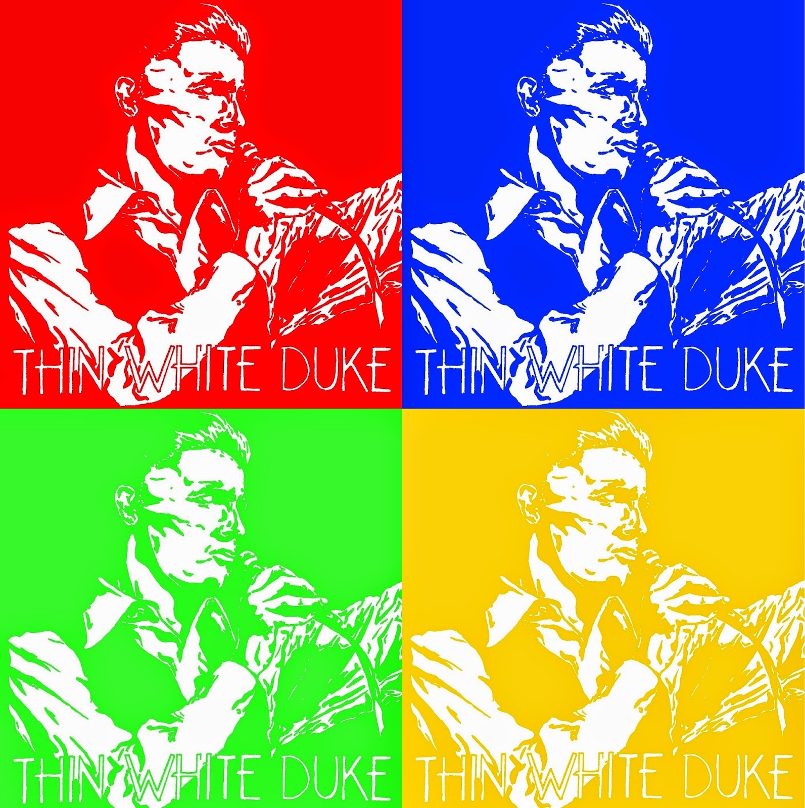
The next examples were to change the colours to basic primary colours (and green to fit a 4 piece), For a more typical Andy Warhol style pop-piece.
Again, One with and without a boarder. I was really really happy with these outcomes! Hopefully I will feel more confident to do something like this in future pieces!
![]() |
| This piece was a test of the yellow colour, I felt this one was too dull and wouldn't fit with the overall look of the finished square. |

~ ~ ~ ~ ~ ~ ~ ~ ~ ~ ~ ~ ~ ~ ~ ~ ~ ~ ~ ~ ~ ~ ~ ~ ~ ~ ~ ~ ~ ~ ~ ~ ~ ~ ~ ~ ~ ~ ~ ~ ~ ~ ~
For this piece the same step was taken as with the first. Using Paint.NET, I used the magic wand tool to remove the white background and written text, so that I was left with nothing but the outlines.
When doing things like this, I like the chance the background colour, just so I know if there is any white spots I may have missed or if there is a area that may need drawing on top of to make the outline stronger and easier to work with.
I used Paint.NET's Fragment Blur plug in to make the background much more striking, but also to make it less simple looking. The clear circles over one another just didn't look right and felt way to unprofessional. The blur effect dulled the shapes together to get the right kind of effect I wanted.
Making a new layer, that I titled "BOWIE SKIN", I then started to mix the colour wheel until I had a fair peach-y skin tone. I also made a much lighter shade and a much darker shade so that I could add shadowing and extra details (as seen above). The eyes and the shirt had their own layers so that I could work much easier and quicker with each area. The eyes layer was underneath the skin tone, but was then merged together when I was happy that the eyes where finished.
When I was looking though the layers, I thought just the skin tones against the background alone looked really funky without the outlines. I screencapped what it looked like as I thought it had a simple but effect look, plus it was interesting to look at and wonder if I could do more with something like this.
Last to do was add the hair colour, which I tried to add fairly messy, as it fit in more with the over all look of this piece. Every now and then I would chance the brightness/darkness of the yellow and add a few more streaks to the hair to add highlights/shadows/details for a slightly more realistic hair look. The shirt also had the same kind of treatment for realism and a more 3D look.

When I was finished with the image, I didn't like it without a boarder, mostly due to the fact the hair had not been fully drawn. Adding a boarder and cropping the image down was an interesting try too, as it focused more on the face. However now the more I look at the outcome of this one, I do quite like the messy look and unfinished endings to the hair and clothing. Although I could try come back to this one and try new things.
~ ~ ~ ~ ~ ~ ~ ~ ~ ~ ~ ~ ~ ~ ~ ~ ~ ~ ~ ~ ~ ~ ~ ~ ~ ~ ~ ~ ~ ~ ~ ~ ~ ~ ~ ~ ~ ~ ~ ~ ~ ~ ~ ~ ~
Subscribe to:
Posts (Atom)